With Camera Angles Straight, Lights Right, Nail It All Down and Snap Away
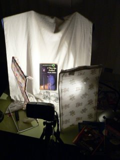
This is a shot without much diffusion because the light is aimed at the opposite fabric screen with what spills onto the book's cover raking across the surface. A shot like this will show every bumped corner, crease, as well as edgewear. Sometimes this is what is called for by the customer considering a book purchase.
This example is apt. The childrens book has a gnarled upper corner (to your left).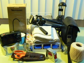
The small accessories, such as tape, a measure, et cetera, are all familiar to photographers who have done product shots.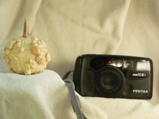
This image of a black, 35 mm film camera could use still more fill flash than I gave it. The same material used as a backdrop was drawn forward over a cross beam made from a monopod camera stand and attached well over the 'nature morte' arrangement. Computer screen monitors vary and the low resolutions I use for all image uploads hide the fact that the original image DOES have detail in the darker shadows.
Sorry about the 1% lean to the right. I was just being lazy about image editing.


3 comments:
can you describe what you used more clearly?
nevermind, i scrolled back a little more. 8)
jgodsey, thanks for dropping in. If you know anyone who is using the commercial lightbox you show in your own sidebar and have had feedback about any of its features, I would like to know more about that.
Your blog at BibliophileBullpen is very interesting, BTW.
Post a Comment